Showing posts with label shading excersice. Show all posts

Monday, March 21, 2011

Different Techniques of Shading

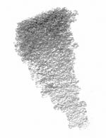
Below the effect of different of shading technique.

This technique is known as hatching. Usually formed from lines cross siri. To switch between light and darkness, begins with the lines that unfold, with intersecting lines a little and slowly sets overlap with more than one line when darkness first. This technique is widespread, Keran generally clean and simple.


This technique for film. Essentially it consists of lines of writing that are rarely used in official photos. It's fast, and highly recommended for quick sketches.


This is the technique of the circular. This model is done by moving your pencil in a circular motion. The left image shows a faster version of this technique with a large loop. The variation of intensity is determined by loop pressure and size. Loose also disyorkan circle for quick sketches.


This is another form of circular techniques. Loop is very tight, giving the entire surface smooth. This technique is very good for skin and clothing, but that does not take more time.


This texture while mixing. We essentially used a pencil-layer Berbezit Beza in tone, and take your fingers and invaded until smooth. This technique is ideal for drawing a smooth surface, especially the skin, and very suitable for those who have no patience.

Monday, March 14, 2011

Graphite Pencil Shading

Today's about shading with graphite pencil.

Value of the painting is like drawing in graphite, although the process is different than with a brush, you must think in terms of areas instead of lines. Shade the shadows, observing the shape and value, the shadow carefully on the edge of the adjacent areas of light. The incredible realism that we see in some pictures of this approach to a very high degree of detail, where the tonal values ​​are closely monitored and finely drawn.


In the example shown here, a detail from a study of still life, a glass of wine offers interesting reflections and highlights. Sometimes it may seem weird, drawing strange shapes on the smooth surface, or the amount of light when you know that wine is dark, or leaving the board to disappear into the background when you want to draw a line, but if you do trust your eyes and try to capture what you see, drawing a realistic look.

Tools for the job:
A pencil H must be as hard as you need for lighter shades, a HB will give you a good half, with B and 2B for the darker shade. For very dark areas of 4 or B 6 may be required.

With the pencil:
Keep your pencils sharpened, and to apply tone in small circular motions on the fast side of the hand. Randomly varying the point of start / stop shading prevent unwanted streaks across a shaded area. Use a pencil and a bit 'more difficult to trace on a surface made with a grease pencil, right on the pitch and fill the tooth of the paper. This also reduces the contrast of texture between the different types of pencil. A tire can be used to increase the points. I recommend that you avoid mixing or smearing beginners at first, but rather learn to make the most of the pencil mark. Once you are confident with your shadow, you might try using a paper log to mix tones. Be sure to use a full range of tone - many beginners are afraid of the shadows, or jump from light to dark, but lost the in-between stages.

Sunday, March 6, 2011

Shading with Pen Technique

These about shading technique of using pen.

Ink drawing is one of the most difficult aspects of drawing in general. You're in the shade and pictures by creating so-called "hard edge design." This is not an easy thing to do, especially if one tries to look a little realistic. You not look real - This is why it is often used in cartoons where the character is an insult to be used or humans or animals.

One of the most common techniques used is called pointillism. It is used for shade and is very common in many styles of ink drawing. This is a set of points close so that no capacity to see everything so far that the surface looks white. This is a relatively easy way to "shadow" in ballpoint pen. Man, the dot size and where they are made. They can also be used for different "forms" better (ie, which can be rounded or straight, and watch anyway of course).

Another technique is called hatching. It's simply a series of lines that are drawn across a surface, ranging from solid black to very far apart (depending on the size of the surface, they may get farther or still be relatively close to represent the white). It's a good technique for beginning artists, as drawing straight lines at varying intervals isn't hard. One should be careful that they GRADUALLY move apart, and that nothing is done suddenly. It won't create the necessary effect if this is done.

Cross-hatching is another element of design. It's a more complicated one, and is usually done by advancing artists. It's drawing lines in two directions (usually perpendicular, but not necessarily) to create shading. It's harder to do, as the intervals of both lines must be watched carefully. This is not recommended for beginning ink drawers, who should most likely start with regular hatching.

A lot of the design lies in the way the artist chooses to set up his/her paper. Overlap should be used (when necessary; in designs, but not always when characters are being created), and interesting negative space should be created as positive images are laid down. This is very eye-catching (the element of design itself) especially in this type of drawing, where there is rarely any color. Ink drawing usually means black and white.

Another thing that an artist can do to make things more interesting is vary the way the line is. This means edges (which can vary between sharp and soft) and, especially, line thickness. Many different pens are often used in order to create a contrast between certain sections. At least three different pens should be available, from around 0.3mm to 1mm. These will create even more "ideas" in the work - very thin lines tend to create sharper edges and clearer images, while thicker lines tend to blur things and make them more "user friendly."

Following these techniques, anyone can come up with a beautiful ink drawing. It's not too hard a skill to learn; it simply employs techniques which must be followed a little more closely than some other types of drawing. This will also enhance anyone's art skills, and will leave them with a good foundation for moving on to smearable materials and color.

Information from this.

Saturday, March 5, 2011

The Stroke of Hatching

Today's we learn about tips to stroke using pen or pencil.

In this section some tips on using your pen or pencil to draw and shade. The good companion to "provide shade and" education is.

Here's a very simple example illustrates the basic way with pencil rendering. "Slinky" stroke (as it calls Anthony Ryder, in his book High Life Drawing) a unique opportunity to describe a particular type of pencil. Ryder called for the "Sneak" because it goes back and forth, back and forth, just like a child toy slinky.

The basis of many processing and shading with pencil and ballpoint pen is. It is as simple! If you are familiar with the preparation of this time, not practice it in your sketchbook. It's fun!


Here's an illustration showing the "crosshatching" of a pencil stroke. It's very simple principle—you just do the "slinky" thing in several different directions, one over the other! (I have put arrows over the different directions of my pencil strokes.) Each different direction adds more tone to the shading, and gets it progressively darker, and darker.


Some more examples of pencil strokes. The example on the left shows how a dark dark tone looks. One bears down a little harder with their pencil, and gets the darkest tone they can while using the "slinky" stroke. They do this going several different directions. VoilĂ ! A very dark (even black) tone.

The example on the right is a more strict crosshatch. It isn't so much of a "slinky" stroke (one lifts the pencil up after making each line) but the same principle applies.


Information from this site.

Thursday, March 3, 2011

Airbrush Shading with Photoshop

Today's about shading with photoshop using airbrush.

The airbrush tool is commonly used for adding dimension with highlights and shading. I've made it easier on you and provided a layered Photoshop file with a pre-drawn heart shape on its own layer.

Practice using the airbrush tool with black and white paint to add dimension to the heart. Your goal is to produce something that looks like the finished example here. You can use layer effects for the drop shadow, but I only want you to use the airbrush for dimensional shading.

Tips:

1. Work on a separate layer!
2. Group the highlight and shadow layers with the heart layer so your paint doesn't spray outside of the heart shape.
3. Notice in my example how the black shading goes all the way to the edge, but the white highlights don't.
4. Mouse users may have a difficult time working with the airbrush tool. If you have a pressure-sensitive tablet, by all means... use it!
5. Look closely at the world around you and notice how real-life objects have highlights and shadows. This is the key to realistic painting in any graphics software.

Info from thissite.

Wednesday, March 2, 2011

Learn Technique of Color Pencil

Let's learn color pencil techniques.

This lesson introduces a few strokes of the pen base color that will be useful in the design. It 's a good idea to spend some' time exploring the color pencil medium with small pieces before groped a design major.

For this lesson, you will need good quality paper for drawing, and colored pencils, including a colorless blender if you have one.

The coup de crayon most fundamental is that you already know: simple face-to-side shading. Now the practice of law mark, leaving the fingers control the direction of the pen or the rotation of the elbow. Many novices accidentally their curved lines, the rotation of the wrist, hand, so that the surface looks shadowing rounded rather than flat.


Practice adjusting the amount of pressure that you apply to the pencil as you shade to precisely control the amount of color you lay down.

Side shading or tip shading? Is there a right way to shade with colored pencil? I don't think so: it depends on the effect you want. Let's take a quick look at the difference between side shading and tip shading with colored pencil.


These info from this site.

Tuesday, March 1, 2011

Shading Technique with Graphite Pencil

Today's about shading technique with graphite pencil.

This advanced technology gives you more control over details of shading as a base shade, creating a smooth texture, which are used can lead to a subject.

* To shade smoothly patients with this relatively coarse texture, like the petals of flowers, glass or any shadow of the object with the same method so that it looks uniform.

* Or you can add more interest to a drawing using different textures. Try using "side of the pencil is in the shade (as described in the shadow of base) to find the rough areas and" pencil tip, or a combination of both, drawing smooth areas for research emerge.

Side of the Pencil Shading

The shading to the right was created with the side of a soft pencil, held in an overhand grip and at a low angle. (See Basic Shading)

I got this article from this source.

Friday, February 11, 2011

Photoshop: Image Shading

Tutorial for image shading.

There are different kind of shading we can create in Photoshop, such as, Drop Shadow,
Reflection Shadow, Original Photographic Shadow etc.

STEP 1

Go to the file menu in Photoshop and select open, from the open dialogue box choose the file you want to work with.
STEP 2

Firstly, you need to draw path around the image in order to remove background. See the Clipping Path Tutorial if you need help to draw path.
STEP 3

Once you have done outlining the image, right click and choose “Make Selection” to select the path. Go to Edit menu>>”Copy >> Paste” or simply press Ctrl on Win, Cmd on Mac+”J” and you will get a new layer with the image inside of the selecti

Image Shading Tutorial path

Drop Shadow Tutorial selection

Image Shading

STEP 4

Click on the “Create a new layer” located on the bottom of the layer palette and you will be given a new layer which you need to fill up with white color.So fill it up with white color and take it underneath of the “Layer 1″.

STEP 5

Double click on the “Layer 1″ to bring the “Layer Style” dialogue box. Click on the “Drop Shadow” located on the left column and choose the desired Opacity, Distance, Spread and Size of the shade. Make sure that the “Preview” box is checked so that you can get live view on how the shade is going to look like.

STEP 6

Once you are happy, click “Ok” in order to apply that style into the layer. Notice that, you can come back to this layer style at any time you want in case you need to edit the shading by simply double clicking on the same layer.

Hopping the above tutorial helps you learning creating drop shadow in photoshop.

Source from this site.

Tuesday, February 8, 2011

Shade Drawing Using Photoshop

Learn how to shade drawing using photoshop.

Shadow is one of the more difficult to create both traditional and digital art. Heavy attention should be given on how light casts an object, and then interact with clothes like shadows and textures. Fortunately, there are tricks that can be used to determine where the light does not shine. For this design, the light source is located in the upper left. Read on to learn how to shade a drawing with Photoshop.

1. Open a line art file.

2. Duplicate the background layer. Use the eraser to erase all lines that will not cast a shadow on anything.

3. Stretch the top layer down. Erase all of the lines on the top layer that overlap areas that wouldn't have shadows cast on them.

4. Set the layer to multiply. This will allow you to color over darker lines without changing the lines. Choose a darker shade than the base color and draw over the lines.

5. Shade the parts of the drawing that are under the desk, such as the legs of the desk and human, since the light source does not hit these parts. Again, use multiply so that the gray does not cover the lines.

6. Shade half of each strand of hair. The part of the hair that is farther away from the light source should be shaded. In this picture, you will find shaded the right side of each strand of hair, since the light source is on the left side.

7. Understand that sometimes objects cast specific shadows on an object. To draw a shadow cast by an object, imagine the shape of the object and distort that object to fit the subject that the shadow is being cast upon. This requires some guessing, since there is no formula to determine exactly how the shadows should cast on the subject.

Read more...

Sunday, February 6, 2011

Shading in Photoshop: Brushing Shining Effects

Tutorial for brushing shining effects with photoshop.

It is time for final adjustments to their metallic effects. Let's go over the edges of the main forms of metal: an effect of light and flowers of light. The idea is to use reflection as a bright chrome, bright as special effects for the 3D shader brush.

First, to maintain their shadows and lighting effects to a new level, everyone is a good idea. This way, you can mix the plane, and the opacity and thus adjust the intensity of extra-brushed shadows and lights. Used to create the key combination Ctrl + Shift + N a new layer in Photoshop.

Lighting

Let's start with the lighting and highlights. To create a real looking metal effect in Photoshop, you have brush a glowing aura near the spots of maximum highlight. That's nearly how the metallic glow and bloom effects work.

To brush a shining edge effect, select the Photoshop Brush Tool (shortcut: B) and pick a big and soft brush through the brush menu or by right clicking anywhere on the canvas while you have a brush selected.

Hold Shift while brushing to create horizontal and vertical strokes. Press Shift + Click to brush straight lines. That's a good idea to remark the shining edges of metallical pieces with a precise and industrial look.

Set the blending mode of the layer with these lighting effects to Screen. Screen increases the light value of the layers below, so it acts as a lighting source, always making the underlying image brighter. That's why screen is the best blending mode to create highlight effects in Photoshop.

The most appropriate color to create metallic highlight effects should be nearly white. Take into account that darker colors haven't nearly any affect in screen mode. Nevertheless, pure white may be too intense, leading to an overexposed result that may not admit further color adjustments. If your source of lighting has any tone, you can add a little bit of extra color and saturation to your layer of highlights (such as a soft yellow for a sunlit metal, and so on).

Shading

You can use a similar technique to increase the strength of the shading effects. Select a soft brush and start painting on those dark areas whose contrast you want to increase.

I would pick a slightly harder and bigger brush than the one used for the lighting effects, with a dark grey color to increase the strength of the shadows.

The blending mode of this layer used for shading purposes should be set to Multiply. The multiply mode always darkens the underlying layers by mixing them with the brushed color. In fact, multiply is just the opposite of screen (that's why the screen blending mode was formerly known as "divide" in older Photoshop versions, as it is actually the inverse operation of multiply).

Now let's see a nearly automated procedure to create light glow effects, and a trick to make the metallic lighting effects more realistic.

Need pictures? See this link. I got source from this.

Circularism Shading Technique

For today I want to describe about Circularism Technique.

A method for shading, texture paint creates value established by the combination of curved lines. Values are from the density in which the curved lines are drawn. For light shades, less curved lines are drawn. For darker tones of many curved lines are close together. Stop the lines to create a smoother appearance that looks more structured light shades Technology circularism.


Visit the following site for more information.

Friday, February 4, 2011

Shading Technique: Hatching

This info about shading technique of hatching.


Hatching is the most common form of construction and is essentially a series of close cooperation between the lines that give the illusion of value. Concealment can be created using a circle, straight, long lines, short lines, and any combination of the above. the movement of hatching eggs to be the apex of the reflective object. For example, if we are drawing a spherical shape, the incubation should be circular, cylindrical surface, the curve should resemble a flat surface, hatching, hatching should describe a straight line. Lines can run in any direction, towards the end of incubation depends on the appearance of the figure. Change the orientation of the roof lines describing the natural shape and form of the question.

Source: drawingprofessor

Wednesday, February 2, 2011

Airbrush Tutorial

About airbrush tutorial.

The Airbrush Master Series is the first complete Airbrush course which covers all different aspects of the Airbrushing field such as, Airbrush Tattoo, Airbrush T-shirts, Automotive airbrush, Airbrush maintenance, trouble shooting the airbrush. In the Airbrush Master Series Airbrush course you will not only be able to learn because of the simplicity of the techniques, but also with the Airbrush Master Series you can go back and review any of the Airbrush techniques at your own convenience

This is the full and complete course.
Disc 1:
Products used
Control Techniques
Practice Skills
Transfering Images
Color & Highlights
Background Scenes

Disc 2:
Surface Prep & Base Coats
Cement (Stone)
Tears (Rips)
Chain
Shattered Glass
American Flag
Sheet Metal
Ice
Wood
Marble
Real Fire
Checkered Flag
Diamond Plate

Disc 3:
Chrome
Traditional & Ghost Flames
Lightning Overlapping Graphics
Barb Wire
Snake Skin

Disc 4:
Advanced Tears
Advanced Fire with Skulls
Burn or Singe
Fire on light background
Blue & Green Real Fire
Advanced Cement Techniques
Advanced Wood Techniques
Advanced Metal Techniques
Quick Fire with Spray guns
Stone Carving
Water Droplets

American Airbrush Association Presents: Vol 01
Basic Airbrush Techniques with Mickey Harris
Learn the basics of how to use your airbrush and the techniques of painting correctly. Mickey Harris takes you step by step thru what you need to know to get up and working quickly. This is an excellent guide for beginner airbrush users.
Learning Airbrush Techniques For Beginners
-Choosing An Airbrush
-How The Airbrush Works
-Beginner Exercizes (Control the ON and OFF of paint)
-distance & angle of the brush
-dots
-flare lines (otherwise known as dagger/flare/rat-tail strokes)
-consistant continual lines
-ladder (control the START and STOP of paint inside a defined area)
-shading techniques (Soft/Hard strokes)
This is a timeless tutorial which is an EXCELLENT video for beginners. If you are just learning the art of Airbrushing, DO NOT miss this one!
The Encyclopedia of Airbrush Tecniques by Michael Leek
A complete A-Z visual directory of airbrushing techniques and how to use them. Using step-by-step demonstrations and the work of a wide variety of professional artists, this book explores all the major methods of working. An initial techniques section shows how basic forms are built up - with guidance on casting shadows, masking, highlighting, ghosting, haloing and more. An inspirational gallery of original work is included with many ideas which will help improve skills and develop individual styles. This comprehensive, informative encyclopedia, is a valuable to addition to the artist's bookshelf.

The first half of Michael E. Leek's Encyclopedia of Airbrush Techniques is devoted to technique and real-world examples of how techniques are used. The second half illustrates themes of professional work, and how they exemplify various techniques and design concepts. To a total beginner, this book is filled with detailed steps and explanations, but does not qualify as a first how-to book. The examples and pictures describe brush technique well enough, but do little to enlighten how and where the masking is applied and removed. The photos range from simple to enticing, and are a good basis for practice ideas and experimenting with the airbrush.
To an intermediate airbrush artist, the techniques are a good example of method, and may help round out a repertoire of skills. Vivid selections of advanced professional airbrush work cry out for a more advanced book of technique combinations.

Source :airbrush tutorial

Saturday, January 29, 2011

Pencil Rendering

Here another video by miandza with pencil rendering.

Friday, January 28, 2011

Thursday, January 27, 2011

Monday, January 24, 2011

Monday, November 1, 2010

Bookmark and Share

Sponsor Links

Stop drawing and painting figures the hard way!
Draw People and Figures Perfectly!
Over 1016 Detailed Illustrations!
www.anatomydrawingsecrets.com

Learn How To Draw CARICATURES
Step By Step Videos!
Easy Step By Step Lessons
www.learn-to-draw.org

Stop drawing cartoons the hard way!...
Finally! You Can Draw Cartoons
Cartoons Drawing can be both a FUN and PROFITABLE hobby or pastime!
www.cartoon-drawing-made-easy.com