Sunday, July 26, 2009

Shading with graphite pencil

Here about shading with graphite pencil.

This shading technique can be used to draw any subject and it can be used to vary the texture in a drawing, too.

  • You can successfully draw smooth subjects with this relatively rough shading, like flower petals or glass, if you shade the entire subject with the same method so that it looks unified.
  • Add even more interest to a drawing by creating different textures. Try using "side of the pencil" shading (as described in Basic Shading) to draw rough looking areas and "tip of the pencil," or a combination of the two, to draw smoother looking areas.

Side of the Pencil Shading

The shading to the right was created with the side of a soft pencil, held in an overhand grip and at a low angle. (See Basic Shading)

Basic Shading Example

Tip of the Pencil Shading

The second example was made with the dull tip of a soft pencil. This time, the pencil was held in an underhand grip. That's the way a pencil is normally held when writing.

You can see that it creates a smoother texture than that created with the side of the lead.

Tip of pencil shading

Combined Shading

The third example combines both of the shading techniques explained above.

When "tip of the pencil shading" is added over "side of the pencil shading," the texture looks a little smoother and darker. Additionally, this type of shading is easier to control so you can use it to shade small areas and to create finer detail.

The paper's texture will effect this type of shading tremendously, so make test hatches on a few different kinds to find a texture you like before you begin.

Tip of pencil plus side of pencil shading technique

Flower shaded with advanced technique

Practice the Shading Technique

The flower to the left was shaded using the combined technique.

To practice this technique, draw the flower by following the steps on the next page.

Save this flower and print it, or open the next page in a new browser window so that you can look at the finished drawing on this page as you work through the lesson.

Saturday, July 25, 2009

Shading with pastels

Above about shading with pastels.

Shading with Pastels- shading is fairly easy with pastels. Since they are such a soft medium, blending them is not a problem at all. Scribble some pastel pigment onto the paper. Using a q-tip (or earbud as some people call them) smear the pigment into the paper.
shading tutorial - pastel shading tutorial - pastel
shading tutorial - pastel (pastel shading example)

Friday, July 24, 2009

Introduction to drawing and shading

Here about the complete introduction to drawing and shading.

Cindy has released a new course on Drawspace.com – The Complete Introduction to Drawing and Shading which conveniently combines the best of Cindy’s Draw In Your Pyjamas and Shade In Your Pyjamas into one course.

You will learn how to draw amazing three-dimensional images using pencil and paper with the smooth shading technique. Even if you have no drawing ability or you are unable to draw a stick figure, you are especially welcomed into this course.

Once you have enrolled you will be able to begin immediately and download a complimentary e-book version of Cindy Wider’s book Paint In Your Pyjamas!

This course has an official start date which is the final chance you have to enter the course however you can get started immediately. You are able to submit your work any time and so long as you complete your course before the final closing date (twelve weeks after the start date) you can work at your own pace. Cindy will comment on one week of your work within three week days. You can enrol and get started right now!

If you’ve been thinking about hopping onboard into Cindy’s Virtual classroom, then this course is an excellent chance to get started on your Drawing and Shading Journey.

Thursday, July 23, 2009

Shade with ballpoint pen

Above about ballpoint pen technique.

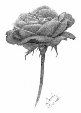
Ballpoint pens can be an excellent medium for serious fine art or illustration. An obvious advantage is precision and control. With pens you can achieve very tight renderings. However that's not all they can do. Ballpoint pens can also be used to express any mood, thought, theme or subject matter. Rendering does not need to be precise to accomplish good works with this medium. Wherever you may stand on the validity of ballpoint as an art medium the following essay and illustrations will provide you with a working knowledge of how it's done.

A Quick Outline

1

Start with a light pencil outline drawing on heavy watercolor paper.

2

Draw over the outline lightly with ballpoint ink.

3

Erase the pencil outlines.

4

Use light parallel lines to block in the base color layer.

5

Then change(crosshatch) directions for the next layer.

6

Work from light to dark. The lightest area will have only one or two layers of ink but the darkest may have five or six.

7

Use black for shadows very carefully.

8

Highlight your deepest shadow areas with a solid slightly wider ink line.

9

Page down for an illustration.

     Most artists start their compositions with a sketch or a series of sketches. This helps them visualize and plan the art work. Painters transfer a copy of the sketch they are using to canvas or watercolor paper using pencil or charcoal. For ballpoint pen drawings  start with a light pencil outline drawing on watercolor paper.

     It is important to use a good quality heavy weight paper like watercolor paper. In my earlier drawings I used light weight drawing paper and  the drawings  developed ripples that were clearly visible when the drawings were scanned. As you work you will go over an area many times and this causes the paper to warp and stretch leaving you with ripples.

     Do not shade your pencil sketch, the graphite gets mixed onto the ballpoint pen nib and muddies your ink colors. Once your outline is down go over it very lightly with your ballpoint pen. Then erase the pencil lines. You can use graphite with pen as a mixed media side by side but not as an under drawing to the ballpoint pen ink.

     Practice using your ballpoint pens. We tend to think that ballpoint pens can't create a variety of lines. This is because we usually use them the same way on the same paper every time we write. The same pen can give you different lines depending on how you use it especially when you use a thicker softer paper. First try pressing down hard to get a dark firm line.  Next try using a lighter pressure to get a thinner lighter line.  Also important to practice are the curve or lack of curve in your lines.  A series of parallel curved lines can help build contour and will add depth to your work. Small blocks of  short parallel lines will give you a flat looking area with a lot of texture.

     Don't try to color areas in as if you are using crayons, instead use a crosshatching technique and build your color in layers. Solid ballpoint ink becomes a dead issue if you try to draw back into it so be sure that's what you want before you do it. It takes patience but crosshatching will give you the opportunity to change colors and create shading and texture. Save any solidly colored areas for last. This gives you the freedom to change your mind.
     With light parallel strokes, draw in the base color of each region in the drawing. This is similar to blocking in colors in an oil or acrylic painting and adding details or shading on top of that. Although I have not tried it yet it is possible to tone an area of paper with another medium before beginning to ink it. The choices however, are limited. You can't use anything chalky which can clog your ballpoint pens and smear. You can't use anything waxy like crayons because the ink must make contact with the paper and again the wax can clog your ballpoint pen. That leaves markers or watercolors. Try using them in a even coat without saturating the paper. Using an under color can represent the final ink color or be another color designed to tone, enhance, or change your final color.

     Work from lightest to darkest by adding layers of ink over the base color. The lightest areas may have only two layers of ink but darker areas may have five or six. Change your stroke directions for each layer of ink. Remember what you practiced using more or less pressure on a ballpoint pen has an effect on the amount of ink it deposits. Use more pressure in darker areas and less in light areas.

     To get strong colors you will need to use many layers of ink. Colors can be modified by combining different ink colors. Work one color into the other with light strokes and change line directions to achieve a crosshatched texture. This will help blend the layers of color and ink more smoothly.

     Depth and dimension can be created by careful shading. If you think of your drawing as being three dimensional and remember how light changes as it crosses a shape you will have more success portraying three dimensions. An added advantage of using ballpoint pen is that your shading lines need not be straight they can curve to help define the contour of an object.

     Working in a very well controlled layer of black ballpoint ink will help to deepen shadows. Leave it subtle unless you want to accomplish a gloomy or darkened emotional component to your work. Highlight your deepest shadow areas with slightly exaggerated outlines and blend them in.

      A printed image is made of dots. (Dots Per Inch DPI ) The display on your computer is created by dots of color, called pixels, as well. (Pixels Per Inch PPI) Impressionists use small brush strokes laid next to each other to create their paintings. Pointillists use round dots of paint for theirs. The lines of a ballpoint pen laid down next to each other and over each other create an image in a way that is not different from those other techniques. You are attempting to take many small units and blend them into one image.
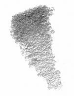
Wednesday, July 22, 2009

The basic of shading


Here about basic of shading.

There are several stages to, and types of shading. Let’s start with a simple circle.
1. The first type of shading and the best place to start for beginning pyrography is positive/negative shading.
Positive/negative shading is used for branding irons, metal cut outs, scroll saw patterns, etc. You really only utilize one shade, and that is the dark. The shadows are really the only thing you are drawing.

Here is a pyrographed picture of my son that utilizes this type of shading as an example.

2. The next type we will talk about is hatching and cross hatching. Hatching is a technique used in mediums such as ink to give the feel of shadow with lines. Cross hatching uses lines that cross each other. Two of these figures illustrate the point simply, and the third shows that depending on how detailed you get, you can really get a good feel of shadow, and still with only one tone of color.

The snake sketch was an ink drawing done with no lines other than “hatch” marks. The sketch of the rose and lantern was an original sketch in ink used to create the pyrographed piece “Revolution”. It illustrates the use of hatching and cross hatching to shade.

3. The next type of shading is another used in monochromatic mediums such as ink. It is another good method for pyrography because like the other methods, it uses only one tone. Pixilating, also known as “pointillism” or "stippling" is a technique for shading by using many small dots at varying distance to create the feel of shading. This technique is time consuming, but it creates such a unique texture that even when more advanced shading is developed, this method can still be the most effective way to shade textured surfaces such as fur or cloth.

This picture is a wood burn which used pointalizing to shade the trees in the background.

4. The last method of shading, and the most difficult to master with pyrography, is “smooth shading”. It is the most realistic shading effect, and will look the best on smooth surfaces like skin.

The second illustration shows how you can calculate a shadow by drawing lines from the object parallel with the direction of the light to give you an idea of where the shadow would be cast. Another note is that we have eliminated the outline. A picture will always look better when you can eliminate the lines that are unnatural.

The illustration of the cube is to show how the same light source would affect a different shape. The top is the most direct surface to the source of light, the front of the cube is in partial light, and the side is completely shaded. Flat surfaces are usually easier to shade.
Smooth shading is an effect created in pyrography by varying the speed you move the burning tip across the surface to create the different tonal values. Speed (rather than temperature or pressure) is the most effective way to create this effect. Of course lower temperatures will help you get a smoother transition between values, but don’t be cautious or afraid to burn dark, as you will find the lighter values will fade over less time than the darker ones.

Tuesday, July 21, 2009

Rendering shading technique

Above about shading technique.

This vase has been modeled as a symmetrical pattern of vertically-oriented surfaces - tiny flat patches which approximate the round shape of the vase. In this image, each tiny surface is shaded separately with a different gray value based on its orientation to the light source.

By introducing a technique called Gouraud shading, we can smooth out the appearance of the vase and hide the individual surfaces from view. The shading is varied on each surface in proportion to values calculated at the edges and from neighboring surfaces.

Phong shading improves the apparent realism of the rendering still further by introducing highlights. The way light reflects from real surfaces depends on how shiny the surface is and on the angle you are looking from. Most surfaces are not shiny, but have a more dull or "matte" or "diffuse" appearance.

Can you tell where the light is shining from? The surface of this vase is just shiny enough to reflect some light directly to the viewer at certain angles, but around the sides the appearance is much duller. Light hitting the vase at flatter angles is scattered more evenly in all directions.

In this last image the shading technique has been extended to let some light pass through the vase - for transparency. Note that the reflection highlights are still there, even if they are less visible.

These shading techniques (and more) have all been incorporated into the generalized rendering technique called ray tracing.

Sunday, July 19, 2009

Shading with colored pencils


Above about shading with colored pencils.

Shading with Colored Pencils- colored pencils can be frusterating to work with. I struggled with them for a while until I tried shading with circulism. It really helped my colored pencil work alot.
shading tutorial - colored pencil
shading tutorial - colored pencil (colored pencil shading example)

Saturday, July 18, 2009

Tight cross hatching


Here’s about tight cross hatching.

Tight CrossHatching- using the ideas from loose crosshatching, this shading method takes it a little further. Tone is built up through repetition and a soft touch. This shading method works really well for animal fur I've found. It's not perfect and some paper tooth will show through.
shading tutorial - crosshatch
shading tutorial - crosshatch 
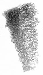
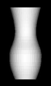
(tight crosshatch shading example)

Friday, July 17, 2009

Loose Cross Hatching


Above about shading technique.

Loose CrossHatching- if you've drawn anything before, you've probably already used this shading method. It's simple yet effective. I think it is very artistic looking too. The basic idea of crosshatching is to overlap lines. Start by drawing a set of diagonal lines next to eachother. Then rotate your drawing 90 degrees and draw another set of diagonal lines that overlap the first set. This can be repeated numerous times to build up tone. Crosshatching can be as tight or as loose as you want it to be.
shading tutorial - crosshatch
shading tutorial - crosshatch 
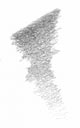
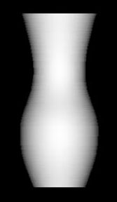
(loose crosshatch shading example)

Dark black technique

Here’s about dark black technique.

Dark Blacks- alot of people have trouble getting a dark black. Honestly, black is not really an option with graphite. If you want dark blacks, try using charcoal. For a dark tone with graphite, take a SHARP 7B pencil. Pressing fairly hard and using the circulism technique, apply the graphite to the paper. Anytime you are dealing with dark tones and graphite, there will be a shine that results. This happens because the tooth of the paper absorbs the graphite quickly and there are extra layers left on top. Glare/shine is a reality when working with graphite. One way to diminish glare is to spray your drawing with a fixative when it is completed. I would recommend using Winsor and Newton Workable Fixative. I've had bad experiences with other products. Also, remember that if you are framing the drawing, shine will be lessened once it is behind glass.
shading tutorial - black
shading tutorial - blacks 
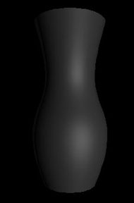
(black shading example)

Thursday, July 16, 2009

Shading and highlight

Above about shading and highlight.

There are several important aspects that it will help you in creating fantastic and realistic images.

In the image note that the light source is coming from the left. The highlight is where the light is strongest and the shadows fall on the side furthest from the light source. The appearance of light and shadow tells us a lot about the surfaces and textures in the image.


Highlights
If you take a second look at the image of the lemon has insert above you will notice that there is an area that is lighter or highlighted on the image. Highlights can help balance shadows and should be used on the edges of objects closest to the light source. Highlights are often overlooked but when used effectively you don’t even notice they are there. While not suited to every situation, a tiny highlight can make all the difference. The “sharper” the highlight, the shinier the surface will appear.

Wednesday, July 15, 2009

Blended circulism technique

Here's about blended circulism technique.

Blended Circulism- graphite is scribbled onto the paper just as in the last method. Using a blending stump, the graphite is blended in small circular motions. This shading method is also great for skin textures.
shading tutorial - circulism
shading tutorial - circulism (blended circulism shading example)

Tuesday, July 14, 2009

Circulism shading

Above about circulism shading.

Circulism- this is a very popular shading method among artists. The idea is to draw very tiny circles that overlap and intertwine. Building up tone can be tedious but the results are worth it. This shading method is great for rendering a realistic skin texture. Use a light touch and build up tone.
shading tutorial - circulism
shading tutorial - circulism (circulism shading example)

Monday, July 13, 2009

About blended shading

Here's about blended shading.

Blended Shading- a popular shading method among pencil artists. Graphite is a wonderful medium because it's very workable. You can lay down graphite and then blend it with pretty much anything. This shading method consists of just scribbling some graphite onto your paper. Now the graphite is blended. I've had good results using regular facial tissues. You can blend with anything though. Play around with different materials to create different shade textures. Facial tissues yield very smooth shading, perfect for flawless looking skin.
shading tutorial - scribbled shading tutorial - blended
Bookmark and Share

Sponsor Links

Stop drawing and painting figures the hard way!
Draw People and Figures Perfectly!
Over 1016 Detailed Illustrations!
www.anatomydrawingsecrets.com

Learn How To Draw CARICATURES
Step By Step Videos!
Easy Step By Step Lessons
www.learn-to-draw.org

Stop drawing cartoons the hard way!...
Finally! You Can Draw Cartoons
Cartoons Drawing can be both a FUN and PROFITABLE hobby or pastime!
www.cartoon-drawing-made-easy.com