Sunday, May 31, 2009

About Kirby’s artwork

Here's about Kirby's artwork

Some time around 1954, work in the field of Comic books began to grow scarce, even for the formerly lucrative team of Joe Simon and Jack Kirby. When Simon became an editor for Harvey publications, the dynamic duo went their separate ways. Kirby struggled to find work, approaching the newspaper syndicates with proposals for strips. In 1956, he returned to work for National Periodicals, developing such ideas as Green Arrow and Challengers of the Unknown.

At some point following the breakup of the team, Jack Kirby’s style began to undergo a series of gradual changes that would alter the look of his figures and the design of his pages. Kirby’s heroes had always possessed a lithe sinewy and somewhat elongated musculature. Beginning somewhere in the mid to late fifties, Kirby’s artwork began to bulk up and to take on a more architecturally geometric quality. Coincidentally around this time, Kirby’s pencils were coupled with the embellishment of an inker of extraordinary skill who was a legendary draftsman in his own right.This was the remarkable Wallace Wood, who had honed his skills with EC Comic’s groundbreaking storytelling.

The unique partnership debuted on the aforementioned series Challengers of the Unknown, a series often considered a forerunner of Lee and Kirby’s Fantastic Four. Kirby soon realized his dream to pen a newspaper strip, one Sky Masters, which was also inked by Wood. Wally Wood is usually described as an intense workaholic who labored obsessively over his pages. In an article in The Comics Journal #197, author Bill Mason says this of Wood’s development as an artist.

“The young Wood taught himself how to draw in a dashing, boldly exaggerated style which he gradually refined by adjusting the spatial relationships in his drawing, through an extremely laborious process of point to point navigation from one solid object to another.”

1-1812

1-1812

You can see in the intricacy of this panel just what Mason is talking about. There is literally no space in this composition that is not being used to maximum advantage. From the pine trees in the background to the gnarled branches and stumps to the scattered figures of the dead with their artfully arranged limbs and the shadows they cast, all the panel shapes are precisely arranged with dark and light almost perfectly balanced.

The ability to do this sort of spatial structuring is something that Wood had in common with Jack Kirby, who is generally regarded as someone who drew seemingly with no effort or preparation. This may be the case for the latter portion of his career, when he had more or less mastered his craft, but having seen some examples from his early swipe file, I believe that Kirby worked extensively on his depiction of reality. One notable example is Robert Riggs illustration that Kirby used for a cover for Police Trap #2. The figures that Kirby more or less copied, who are standing in a station house show a serious concern with the understanding of the arrangement of deep space.

I believe that Kirby’s artistic collaboration with Wallace Wood on Challengers and Sky Masters had a profound effect on Kirby’s approach to his work. Wood’s obsession with the meticulous arrangement of spatial relationships reinforced a similar tendency in Kirby, who became for the next ten years increasingly more proficient at utilizing every object placed on his page to maximum compositional advantage.

I also believe that Wood’s mastery of black spotting affected Kirby’s perception of and use of dark and light in his pencils.

Kirby first worked with Wood on issue #4 of Challengers of the Unknown. The previous issue is inked by Marvin Stein, and while there are backgrounds, they are a bit uninspired by Kirby standards. Wood’s inking of the following issue shows us that we are in for something completely different. In this splash panel, there is an almost geometric arrangement of the figures emerging from the background.

2-COTA splash

2-COTA splash

In the Stein inked pages, the machinery that Kirby draws function as a device to establish setting and has only a secondary design purpose. Wood’s inspired rendering seems to usher in the first era of techno-Kirby, where nearly all surfaces of all objects and in particular machinery, are covered with detail that serve primarily a design function.

Friday, May 29, 2009

Shading hair

Above about hoe to shade hair.

A good thing to remember when you're colouring hair is to use a light source while you're shading. Look at your hair in a mirror. It's not ridiculously shiny all over... so don't go mental with the highlights. A few subtle ones and lots of shade is more effective because it draws the highlights out through contrast.

Wednesday, May 27, 2009

Lesson of shading

This is about how to make shading.

There are many otherwise good artists who can create a beautiful 2D line drawing, but when trying to give it depth through light, dark, and middle shading values, sometimes they fall short. An excellent exercise for any artist, whether beginner or expert is gray value study. Every color has a value. It can be thought of as intensity or vibrancy as well. If you use a crayon and color with a lot of pressure you will create a deeper value than you would have had you colored lightly with less pressure. The same goes for pencil and they gray values created. It applies to line work as well with hatching and cross-hatching, though the latter can create deeper value simply with more lines spaced closer together. Below you will see an excellent exercise to practice your pencil shading work with.


You simply start by making the first box as dark as you can and make each box subsequently lighter. There are only six boxes in each row. There are actually so many values in between these, but you can challenge yourself later by adding more boxes. For real beginners you may want to start with fewer boxes. Q-tips can also come in handy for blending and picking up some graphite from a heavy area and using it to shade as well.
Hatching is simply a sequence of lines moving in the same direction. Like this //////. You can achieve lighter or deeper values based on the heaviness of your lines and the spacing between them. For a lighter value, use lighter lines space further apart. For deeper values, use heavier lines spaced closer together. Cross hatching is very similar to hatching except you use lines that cross each other like this XXXXX. The more layers of lines going in different directions the deeper the value will appear. The tip for hatching applies here as well with pressure and spacing.
The final row is reserved for scribbling. Here is where you get to have fun and use any kind of lines you want, just make sure they get lighter as you go. The more pressure you use and the less white space you leave will result in deeper values and vice-versa. This acts as a good warm up for this next project though it is a great thing to practice over and over- just like scales on a musical instrument.

Tuesday, May 26, 2009

Talks about point-based rendering

Above are about point-based rendering.

Point-based rendering, as the name implies, is to visualize objects using point primitives instead of polygonal primitives such as triangles. This idea of using points as rendering primitive was first suggested by Marc Levoy and Turner Whitted in 1985 (You can find its abstract and the full paper at here). And afterward, a novel technique named QSplat was introduced by Szymon Rusinkiewicz and Marc Levoy in 2000, and that ignited a fire on this subject.

At this point, we should ask ourselves, ‘why do we need alternate primitives other than triangle?’ We can find a good answer for this question here in QSplat paper abstraction.

Advances in 3D scanning technologies have enabled the practical creation of meshes with hundreds of millions of polygons. Traditional algorithms for display, simplification, and progressive transmission of meshes are impractical for data sets of this size.

I think the most important motive of point primtives is an enormous quantity of newly acquired data in practice (due to its increased volume and accuracy). We can think of the simplest case, where more than hundreds of millions of primitives, in a single rendering frame, are projected onto a screen of limited pixel resolution such as 800 by 600. In such a scene, most single primitive will contribute to a single pixel (or to even smaller) in the final displayed image. And that means, triangle primitives are not a good choice then. Anyway, to avoid some redundancies such as triangular-setup stage required for rendering triangular polygon meshes, we can choose points as our rendering primitives.

After the advent of QSplat, many researchers have rushed into this field (I was one of them :) ), and more sophisticated and improved techniques were introduced. Surface splatting techniques using EWA (elliptical weighted average) filter provided very high quality anti-aliased images [web site]. And others have focused on exploiting the programmable graphics pipeline. Sequential point trees technique is one of them. They proposed an innovative method of serializing the whole point hierarchy into graphics memory, and then the GPU by itself can apply a level of detail of the object on the fly [full paper].

In 2005, Mario Botsch et al. proposed more advanced GPU technique in their paper, and later they improved their own algorithm using deferred shading technique. Their algorithm was an application of the Phong shading and deferred shading technique (commonly used in polygonal rendering techniques). And, by exploiting the GPU power, they could achieve both high-quality image and the real-time frame rates at the same time.

Monday, May 25, 2009

What is shading?

Did you know what is shading means?

Shading is a process used in drawing for depicting levels of darkness on paper by applying media more densely or with a darker shade for darker areas, and less densely or with a lighter shade for lighter areas. There are various techniques of shading including cross hatching where perpendicular lines of varying closeness are drawn in a grid pattern to shade an area. The closer the lines are together, the darker the area appears. Likewise, the farther apart the lines are, the lighter the area appears. The term has been recently generalized to mean that shaders are applied.

Light patterns, such as objects having light areas and shaded areas, help when creating the illusion of depth on paper and on computer screens.

In computer graphics, Shading refers to the process of altering a color based on its angle to lights and its distance from lights to create a photorealistic effect. Shading is performed during the rendering process.

Angle to light source

Shading alters the colors of faces in a 3D model based on the angle of the surface to the sun or other light sources.

The very first image below has the faces of the box rendered, but all in the same color. Edge lines have been rendered here as well which makes the image easier to see.

The second image is the same model rendered without edge lines. It is difficult to tell where one face of the box ends and the next begins.

The third image has shading enabled, which makes the image more realistic and makes it easier to see which face is which.

Rendered image of a box. This image has no shading on its faces, but uses edge lines to separate the faces.
This is the same image with the edge lines removed.
This is the same image rendered with shading of the faces to alter the colors of the 3 faces based on their angle to the light sources.


Sunday, May 24, 2009

Pen and ink lessons

Here's about shading technique.

I learned about these shading techniques from a bunch of sites, but these were the most helpful:

Saturday, May 23, 2009

About Glass Etching

Here's about Glass Etching.

What is Glass Etching? Glass engraving is the abrading or roughening of a piece of glass in preferred areas in order to create a new cool design. It is a mode to produce a frosted sketch on the surface of a piece of glass so that it looks nice, but it is much more than that. It can also be utilized to carve a design deep into the glass or to produce a shaded design that looks like subtle airbrushing or piece of craft, but is eternally etched in the glass.

Using the same tool and techniques, it is also possible to etch or carve on stone, ceramic or wood, and even to etch designs on metal to produce cool design outcomes. When doing etchings the main notion is to usually crush deeply into the surface of the glass, wiping out any possibility of fine details and crunching the glass surface into tiny shards that leave a rough surface while crunching where it’s been etched.

One of the systems of etching is called sandblasting. It is a general term used to describe the act of driving very fine bits of material at high-velocity to clean or etch a surface. Sand is the most commonly used material, but since silicosis (a lung disease) is caused by extended inhalation of the dust created by sand, other materials are now used in place of sand. Any small, moderately uniform particles will work, such as steel grit, copper slag, walnut shells, powdered abrasives, even bits of coconut shell.

Due to the dangers of inhaling dust during the process, sandblasting is carefully managed, using an alternate air supply, protective wear, and proper ventilation. Due to the high density of these materials they settle down rapidly and provide a dustless setting for the workers to perform their tasks.

There is another method of etching that is called chemical high definition etching. High definition etched glass works well in a variety sizes and decor items. Custom etching can improve room dividers a glassy looks, cabinet doors, or other glass or etched mirror decor items to correspond to your personal decorating tastes. Since this etching technique works for any photo, you can etch any of your prized photographs or any other meaningful moment replicated as a one-of-a-kind etching. The technique for this sort of high definition etching was perfected in the early 1990s, making it feasible to reproduce any two-dimensional image on etched mirrors or glass etchings.

Custom artwork or photographs can be etched with a photo beautiful look to the etching. By selecting the most important elements of an artwork or photo and etching just those elements on the glass, the rest of the mirror or glass remains in its normal state. The result is a frosty etching on a shining mirror or on crystal clear glass. This technique provides far greater depth and shading for the etching than customary etching techniques can carry out. Traditional etchings are done by sandblasting the portions to be etched. While this sandblasting technique works well for creating flat, silhouette-type etchings with nominal shading, it cannot reproduce the nuances of an genuine artwork like high definition etching does.

High definition etching has brought a unique look to the new era of glassy and mirror materials and a new method of embellishment. The etched glass tops on coffee tables and end tables can change tables usually used as a platform for decorative presentations into accent pieces, but now they are themselves works of art in conspicuous places in the room.

High definition chemical etching presents a greater degree of detail as a surface burn, while sandblasting cuts deeper and can carve glass into attractive artworks. Whether sandblasting or high definition etching, there are many more preferences to consider with etching the next time you have a special decorating plan or gift to buy.

Wednesday, May 20, 2009

Learn shadow in Photoshop

Here's about how to to shadow in photoshop

[1]-First of all Open New Document of Custom Size,Height & Width 400×400 pxl,Resolution 72 & Mode RGB Color

Photoshop-Orange-Fruit-Logo-Stock-Photo1

[2]-Now Open New Layer & then create the following selection with the help of ‘Pen Tool’ right click select ‘Make Selection’

Photoshop-Orange-Fruit-Logo-Stock-Photo2

[3]-In Make Selection ‘Feather Radius’ should 0 pxl,Tick on New Selection & then ok & your image should look like as shown below

Photoshop-Orange-Fruit-Logo-Stock-Photo3

[4]-Now fill the selection with ‘fb8d04′ color & then select ‘Burn Tool’ Photoshop-Orange-Fruit-Logo-Stock-Photo4 & create the following shading

Photoshop-Orange-Fruit-Logo-Stock-Photo5

[5]-Now select ‘Dodge Tool’ Photoshop-Orange-Fruit-Logo-Stock-Photo6 & Highlight the some parts & create some shading with the help of ‘Burn Tool’

Photoshop-Orange-Fruit-Logo-Stock-Photo7

[6]-Now go to Filter>Distort>Glass & use the following settings
Photoshop Technique-How to use the Glass feature

Photoshop-Orange-Fruit-Logo-Stock-Photo8

[7]-Now Open New Layer & then create the following selection with the help of ‘Pen Tool’

Photoshop-Orange-Fruit-Logo-Stock-Photo9

[8]-Now fill the selection with ‘497804′ color & create the some shading with the help of ‘Burn & Dodge Tool’

Photoshop-Orange-Fruit-Logo-Stock-Photo10

[9]-Now set the 2 pxl Brush Tool,Open New Layer & then create the following shape with the help of ‘Pen Tool’ right click select ‘Stroke Path’

Photoshop-Orange-Fruit-Logo-Stock-Photo11

[10]-In Stroke Path select ‘Brush’ & then ok & your image should look like as shown below

Photoshop-Orange-Fruit-Logo-Stock-Photo12

[11]-Now select ‘Erase Tool’ & use the following settings

Photoshop-Orange-Fruit-Logo-Stock-Photo13

[12]-Now remove the some parts with the help of ‘Erase Tool’

Photoshop-Orange-Fruit-Logo-Stock-Photo14

[13]-Now Highlight the some parts with the help of ‘Dodge Tool’

Photoshop-Orange-Fruit-Logo-Stock-Photo15

[14]-Now create the following selection with the help of ‘Pen Tool’

Photoshop-Orange-Fruit-Logo-Stock-Photo16

[15]-Now fill the selection with same color & create the some shading with the help of ‘Burn & Dodge Tool’ & after that set the 1 pxl Brush Tool & create the following shape with the help of ‘Pen Tool’
right click select ‘Stroke Path’

Photoshop-Orange-Fruit-Logo-Stock-Photo17

[16]-In Stroke Path select ‘Brush’ & then ok & highlight the some parts with the help of ‘Dodge Tool’ & after that Open New Layer & create the following selection with the help of ‘Pen Tool’

Photoshop-Orange-Fruit-Logo-Stock-Photo18

[18]-Now fill the selection with ‘497804′ color & create the some shading with the help of ‘Burn & Dodge Tool’ & then create the following selection with the help of ‘Elliptical Marquee Tool’

Photoshop-Orange-Fruit-Logo-Stock-Photo19

[19]-Now Open New Layer [this layer should below all layers] & then fill the selection with ‘000000′ color & then go to Filter>Blur>Motion Blur & use the following settings
Photoshop Technique-How to use the Motion Blur features

Photoshop-Orange-Fruit-Logo-Stock-Photo20

[20]-Thanks for read this Photoshop Tutorial.I hope you have enjoyed & learnt some Photoshop Techniques & the Final Image should look like as shown below

Photoshop-Orange-Fruit-Logo-Stock-Photo21

Tuesday, May 19, 2009

About cross hatching and stippling

This is how to make cross hatching and stippling

Cross Hatching and Stippling are the two basic techniques for the creation of tone and texture in an ink drawing. These are traditional techniques that have been used by artists for centuries. They can be applied in a tightly controlled manner, as in our drawing of Whitby above, or more freely and expressively, as in the Van Gogh drawing of trees below.

Van Gogh - Tree with Ivy in the Asylum

Vincent Van Gogh (1853-1890)
Tree with Ivy in the Asylum,
(ink on paper, 1889)

In 'Tree with Ivy in the Asylum', Van Gogh intuitively combines cross hatching and stippling to create a bold expressive technique that naturally reflects the form, texture and energy of its subject. The spontaneity and fluidity of his pen strokes say as much about the artist's personality as they do about the subject. It is the skill of an artist's technique, filtered though a personal vision of the subject, that determines the quality of an artwork.

Whitby Detail 1

Combining Cross Hatching and Stippling
Whitby Detail 1 (top left)

If we look at a close-up detail of our Whitby drawing, it should help to reveal how cross hatching and stippling are combined for a tonal and textural effect. A range of cross hatching and stippling techniques have been used to give tone and texture to the walls and roofs. These techniques are not used independently from one another, but are combined to increase their effectiveness. After the brickwork and roof tile patterns had been sketched in, areas of tone were hatched and cross hatched over these to suggest depth and form. Stippling was then applied in various densities to both plain and brick patterned walls in order to convey the grime and texture of the different surfaces.

Whitby Detail 2

Whitby Detail 2 (bottom right)

In detail 2, graduating densities of stippling have been used to express the texture of the bushes and trees. Hatching and cross hatching, combined with stippling, have been applied to suggest a variety of other surface qualities ranging from metal lock-up doors, to smooth concrete and rough brickwork.

As a general rule, it is probably easier to apply cross hatching first, in order to build up the tonal structure of the drawing. Stippling tends to be used later to add subtlety and texture to the work.

Monday, May 18, 2009

Shading with pen and ink

About pen and ink strokes

PEN & INK STROKES
  1. Contour Lines: Contour lines are marks that precisely follow the curves and planes of an object.
  2. Parallel Lines: Parallel lines are straight marks that extend in the same direction. Sketched free-hand, the lines need not have ruler straight perfection.
  3. Crosshatching: Crosshatching consists of two or more sets of contour or parallel lines that are stroked in different directions and intersect.
  4. Stippling: Stippling is a grouping of dots.
  5. Scribble: A scribble line is a free flowing (but controlled) mark that loops and twists in a sketchy manner.
  6. Wavy Lines: Wavy lines are drawn side by side in a repetitive pattern
  7. Crisscross Lines: Crisscross lines flow with the contour of an object and are arranged in a staggered, randomly crossing manner.

Sunday, May 17, 2009

Shading with pencil for exersices

Exercises your shading technique with pencil.

Graduated tone can be used to create the illusion of space and form in a drawing. It is a very useful skill to develop.

Use a B, 2B, or darker grade of pencil for your shading. Lighter grades (H, 2H etc.) will not give enough depth to your darkest tones.

Just start by shading the area you wish to be dark and slowly build up the tone. As you work towards the light, gradually ease the pressure on your pencil until you can no longer see it. You then patiently repeat this process, building a depth to the shading and trying to keep the tonal changes as smooth as possible until you achieve the intensity of tone that you desire.

Below are some more exercises of increasing difficulty which will test your shading skills to the limit.

Shading Exercise 2

Shading Exercise 3
Shading Exercise 4
Shading Exercise 5
Shading Exercise 6
Shading Exercise 7

Practice these exercises to help improve your drawing skills.

Drawing shade with pen or pencil

How to draw shade with pen or pensil? Here are the tips.

This section will give a few tips on using your pen or pencil to draw and shade. It is a good companion to the "Shading and Rendering" tutorial.

pencil strokeHere's a very simple illustration, showing the fundamental way of rendering in pencil. The "slinky" stroke is a unique way to describe a certain kind of pencil stroke. Ryder calls it a "slinky" because it goes back and forth, back and forth, just like that childhood toy, the Slinky.

This is the basis for much of the rendering and shading in pencil and pen. It's as simple as that! If you are unfamiliar with drawing with this stroke, practice it in your sketchbook. It's fun!

cross-hatched pencil strokeHere's an illustration showing the "crosshatching" of a pencil stroke. It's very simple principle—you just do the "slinky" thing in several different directions, one over the other! (I have put arrows over the different directions of my pencil strokes.) Each different direction adds more tone to the shading, and gets it progressively darker, and darker.

More pencil strokesSome more examples of pencil strokes. The example on the left shows how a dark dark tone looks. One bears down a little harder with their pencil, and gets the darkest tone they can while using the "slinky" stroke. They do this going several different directions. VoilĂ ! A very dark (even black) tone.

The example on the right is a more strict crosshatch. It isn't so much of a "slinky" stroke (one lifts the pencil up after making each line) but the same principle applies.

Shading technique with graphite pencil

Above are the technique of shading

This shading technique can be used to draw any subject and it can be used to vary the texture in a drawing, too.

  • You can successfully draw smooth subjects with this relatively rough shading, like flower petals or glass, if you shade the entire subject with the same method so that it looks unified.
  • Add even more interest to a drawing by creating different textures. Try using "side of the pencil" shading to draw rough looking areas and "tip of the pencil," or a combination of the two, to draw smoother looking areas.
Side of the Pencil Shading

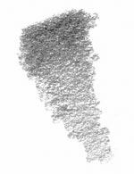
The shading to the right was created with the side of a soft pencil, held in an overhand grip and at a low angle.

Basic Shading Example
Tip of the Pencil Shading

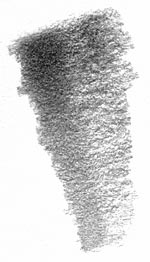
The second example was made with the dull tip of a soft pencil. This time, the pencil was held in an underhand grip. That's the way a pencil is normally held when writing.

You can see that it creates a smoother texture than that created with the side of the lead.

Tip of pencil shading
Combined Shading

The third example combines both of the shading techniques explained above.

When "tip of the pencil shading" is added over "side of the pencil shading," the texture looks a little smoother and darker. Additionally, this type of shading is easier to control so you can use it to shade small areas and to create finer detail.

The paper's texture will effect this type of shading tremendously, so make test hatches on a few different kinds to find a texture you like before you begin.

Tip of pencil plus side of pencil shading technique
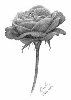
Flower shaded with advanced technique

Practice the Shading Technique

The flower to the left was shaded using the combined technique.

To practice this technique, draw the flower by following the steps on the next page.

Save this flower and print it, or open the next page in a new browser window so that you can look at the finished drawing on this page as you work through the lesson.

Bookmark and Share

Sponsor Links

Stop drawing and painting figures the hard way!
Draw People and Figures Perfectly!
Over 1016 Detailed Illustrations!
www.anatomydrawingsecrets.com

Learn How To Draw CARICATURES
Step By Step Videos!
Easy Step By Step Lessons
www.learn-to-draw.org

Stop drawing cartoons the hard way!...
Finally! You Can Draw Cartoons
Cartoons Drawing can be both a FUN and PROFITABLE hobby or pastime!
www.cartoon-drawing-made-easy.com